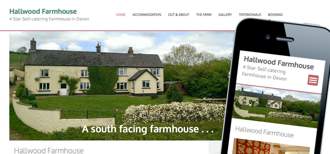
This website was already in WordPress and had been started with a template. As with so many DIY projects our client had struggled to finish it alone and sought Pynto’s professional help. We adjusted the template so that it was fully responsive and now works for large screen, tablets and phones. We also customised the design so it looked less like a template and more fit for the purpose of showing off this lovely holiday accommodation. We also helped with the content, making sure all the attractive qualities of the farmhouse were communicated and booking encouraged. There is also a thumbnail gallery that opens a lightbox slideshow when any image is clicked.
Our clients were very happy with this cost-effective solution and have asked us to work on their other websites now.
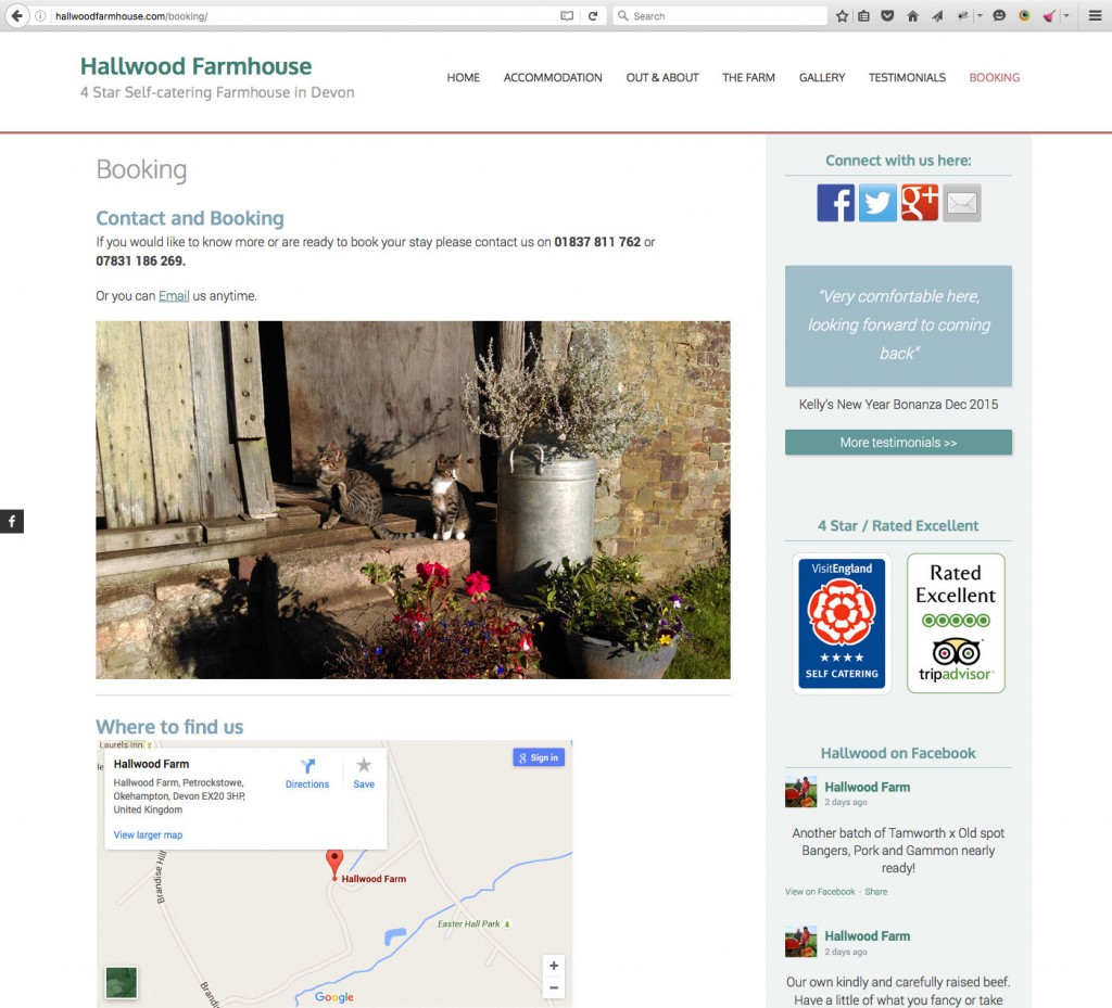
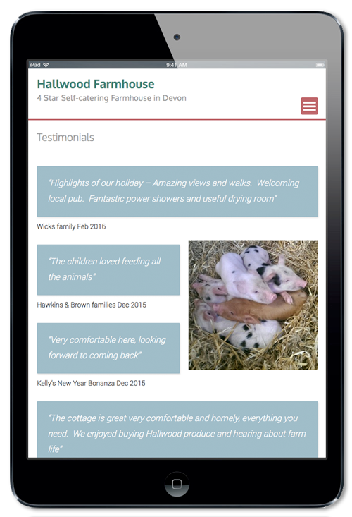
iPad or tablet view
The website adapts automatically for smaller screen sizes. The sidebar drops underneath to allow the content to show at a clearly readable size.
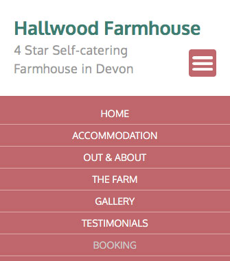
Smaller screen menu
For smaller screens the navigation menu is shown as the familiar menu icon (3 x horizontal lines). When this icon/button is pressed the menu expands for clear and easy site navigation.
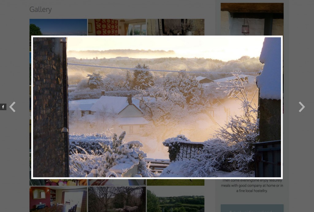
Interactive gallery
The gallery displays all images as a grid of thumbnails. Any of these, when clicked, with show enlarged as part of a slideshow, from here all gallery images can be scrolled to. Viewers simply click the site in the background to go back to the gallery page.

